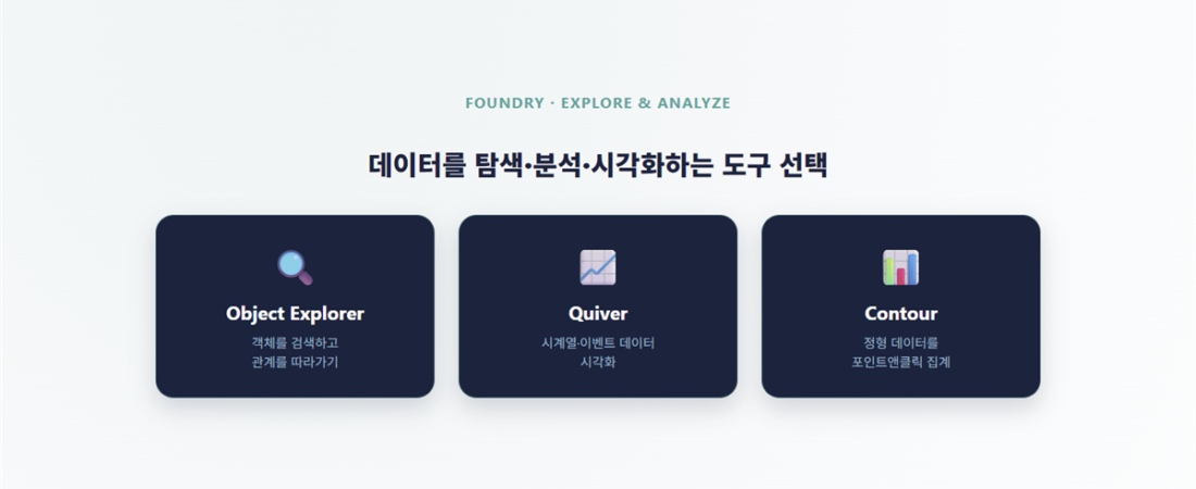
Why you need to know all three tools
The short answer: Object Explorer, Quiver, and Contour differ in the kind of data they handle and when you’d reach for each. Foundry doesn’t give you just one way to look at ontology data. All three share the same goal — viewing and analyzing ontology objects — but the data they’re built for and the moment you’d use them differ. Learning them separately makes it easy to lose track of which one fits which situation, so this article lines them up side by side with practical selection criteria.
Object Explorer — search objects, follow relationships
Once you’ve built Object Types and Link Types in Ontology Manager, you often need to skim “what’s actually in this data” before building a specific app around it. Object Explorer is a general-purpose tool for searching ontology objects and exploring their relationships — used before building a specific app, or while investigating data.
A traditional keyword search only checks “does the name match.” Object Explorer goes a step further: it follows the Link relationships between objects and shows you the surrounding context along with the match.
- 360° object view: Select an object and see every Property plus every connected object on one screen.
- Interactive graph exploration: Click and double-click through a graph of nodes (objects) and edges (Links) to expand relationships as you go.
- Dynamic facet filtering: Any Property marked Filterable in Ontology Manager shows up here as an actual filter option.
Object Explorer isn’t really meant to be a screen you ship to end users — it’s mainly for exploring data before building a Workshop app, or for digging deep into one specific object.
Quiver — visualizing time-series and event data
Quiver visualizes many objects and time-series data at once to help you spot patterns. When you’re working with data where the time axis matters — sensor readings, transactions — it applies operations like moving averages, interpolation, and correlation analysis as built-in features, with no code required.
- Ontology-based visualization: Uses Object Types and Link Types directly, so you build charts by following relationships instead of writing complex join queries.
- Time-series handling: Downsamples high-frequency time-series data so it renders in near real time.
- Linked visualizations: Filter a range on one chart, and the other charts and object sets on the same screen update together.
- Action integration: You’re not limited to just viewing results — you can run an Action Type right from the screen to record a status change.
Contour — point-and-click aggregation of structured data
Contour is built for business users who want to analyze large volumes of structured data without writing SQL or Python. Filters, joins, and aggregations built with mouse clicks are automatically translated into optimized distributed computation on the backend.
- Analysis Path: Each analysis step — applying a filter, grouping, joining — stacks up as a chain of “boards.” Because it’s non-destructive, you can always go back and adjust an earlier step.
- Point-and-click joins and formulas: Perform Left/Right/Inner joins as a visual diagram, and create derived variables on a formula board.
- Dashboard conversion: Set parameters on an analysis, and when a dashboard user changes a value, the entire analysis chain recalculates in real time.
How to choose between the three
| Situation | Recommended tool | Why |
|---|---|---|
| Investigating one specific object and following its relationships | Object Explorer | Built for graph exploration and a 360° view |
| Looking at change over time, sensor/event patterns | Quiver | Strong at time-series handling and linked multi-chart views |
| Point-in-time aggregation, comparison, or a recurring report | Contour | Strong at join/filter/formula-based structured analysis |
The three aren’t mutually exclusive. A natural flow is to get oriented with Object Explorer first, then move to Quiver if the time axis matters, or to Contour if you need aggregation.
Common mistakes
- Trying to do every investigation in Object Explorer alone: if the same investigation gets repeated by multiple people, it’s better to turn that flow into a fixed Workshop screen.
- Forcing Quiver onto plain structured aggregation: building something like a simple revenue rollup (not time-series) in Quiver makes something Contour’s point-and-click aggregation would handle more simply into something complicated.
- Letting an Analysis Path grow without organizing it (Contour): the longer a board gets, the easier it is to lose track of which step applied which condition. Name your steps clearly as you go.
- Building filters separately on every screen (Quiver): if you don’t take advantage of one chart’s filter propagating to the others, you’re just laying out several disconnected charts.
What to read next
If you want to turn analysis results into a dashboard shared across departments, continue with Insight. To see how a given piece of data was produced, continue with Data Lineage.
Frequently Asked Questions
Q. Do I really need to learn all three tools?
They aren’t fully interchangeable, since they’re built for different kinds of data. That said, most practitioners start by mastering whichever one their own work calls for most often.
Q. Is Object Explorer similar to drill-down in a BI tool?
Similar, but Object Explorer moves between objects relationally by following the ontology’s Link Types, which makes its exploration range more flexible than a simple drill-down.
Q. What kind of data is Quiver built for?
It’s built for timestamped time-series and event-log data, and is mainly used to visualize equipment sensor data or event streams.
Q. How is Contour different from a regular spreadsheet pivot table?
The experience is similar, but Contour references live ontology data directly, and lets you save aggregation results back into pipeline logic.
Q. What’s a common mistake?
Picking the wrong tool for the job — for example, using Contour for time-series analysis makes handling the time axis unnecessarily awkward, so it’s important to judge the nature of your data first.